|
|
|

|
|
«
Previous Thread
|
Next Thread
»
|


|
| Data Visualizations |
| Navigation: |
| #1 | |
|
Administrator
27-07-11 |
Visualization of #norway #oslo #utoya #blamethemuslims
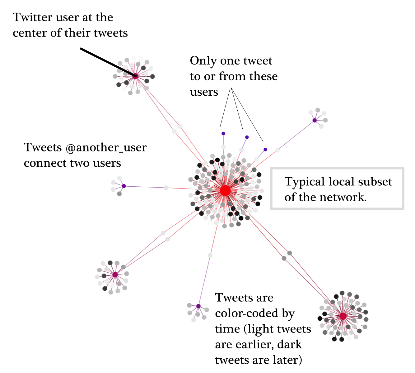
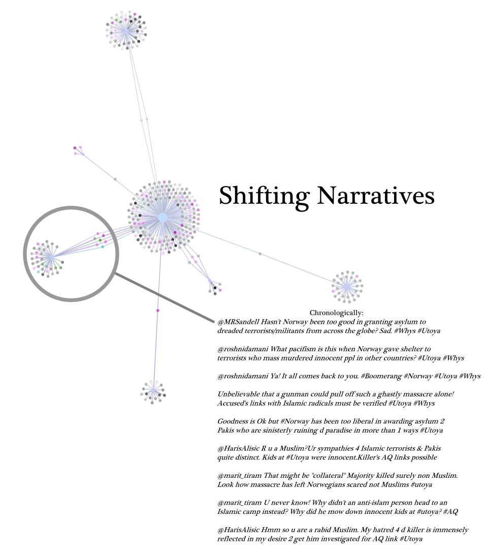
Below are a set of visualizations of the twitter traffic after Breivik's attacks in Norway. This particular dataset includes all of the tweets with #norway, #oslo, #otoya and #blamethemuslims hashtags from the 22nd to the 25th of July.
The tweets have been visualized in Gephi as a bipartite graph (or network) meaning that they show two types of nodes: tweets and Twitter users. A user is connected to all tweets that they've sent and to all tweets that are directed at them (through the @username aspect of a tweet). Each image is an Ego Network of a particular user, showing the tweets that they've sent, any users connected to those tweets, and any tweets that those users have sent. Tweets are color-coded by timing such that the earliest tweets are lighter and the darker tweets are later (relative to the dataset). Further, any tweet that contains the word Christian are colored yellow, tweets that mention terror are colored fuchsia, tweets that mention Muslim or Islam are green and tweets that mention Muslim/Islam AND terror are teal (again, light to dark based on time). The graphs represent frequency of tweets with the listed words. All words searched are actually lemmas, so Islam includes Islamic/Islamist, terror includes terrorism/terrorist/etc.      Visualizations contributed by: https://dhs.stanford.edu/about/ |
|
1687 views
|
| Thread Tools | Search this Thread |
| Display Modes | |
|
|